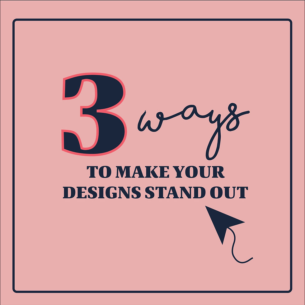
3 Ways to Instantly Improve Your Design
- Brittany Hanlon
- Apr 27, 2025
- 2 min read

Great design isn’t about cramming in more — it’s about being intentional with what you include. Whether you’re creating social posts, flyers, or branding materials, these 3 design tips will instantly help your visuals look more polished and professional (even if you're not a designer).
1. Have a strong focal point
Every design needs a clear visual anchor — something the viewer’s eye is naturally drawn to first. This could be a bold headline, a striking photo, or a strong shape. Without a focal point, your design can feel scattered or overwhelming.
Quick fix: Ask yourself, “What do I want people to notice first?” Then design around that.


In the example above, the logo on the left is blah and boring. There's nothing eye-catching; there's nothing to make it stand out in a crowd. You need something that's going to draw the eye. In the example on the right, the dog house with the cute paw print immediately stands out and makes a great focal point. Bonus points, you can pull out the dog house to use as a logo mark.
2. Leverage color psychology
Color isn’t just aesthetic — it’s emotional. Different hues evoke different feelings, so choosing the right palette can reinforce your message big time. Warm tones like red or orange feel energetic and bold. Cool tones like blue and green feel calm and trustworthy.
Quick fix: Choose 2–3 brand colors and use them consistently. Let color work for your message, not against it.


Don't be afraid of a little color, if it works for your brand! Key words here: if it works. Black and white logos are exactly what some brands need, but some need that splash of color! In the example on the left, this basic logo is way too neutral for this fun brand. The example on the right is much more playful and really pops for this brand.
3. Embrace white space
White space (aka “negative space”) is one of the most powerful tools in design. It gives your layout breathing room, improves readability, and helps the important stuff stand out.
Quick fix: Don’t feel the need to fill every corner. Let your content breathe — your audience will thank you.


Don't overclutter your logo! In the example above, the logo on the left has a little bit of everything! It's got a logo, it has additional text, it has a pattern, it has a border. IT HAS TOO MUCH! In the example on the right, the after is simplified and clean, but still pulls in the fun pattern in a more simplistic way.

Want more design tips like this? Hi, I’m Britt — a freelance graphic designer who helps small businesses create branding that’s clean, confident, and totally custom. If your designs could use a glow-up (or you just want to learn more), follow me on Instagram or reach out here — I’d love to help you level up your visual game.


Comments