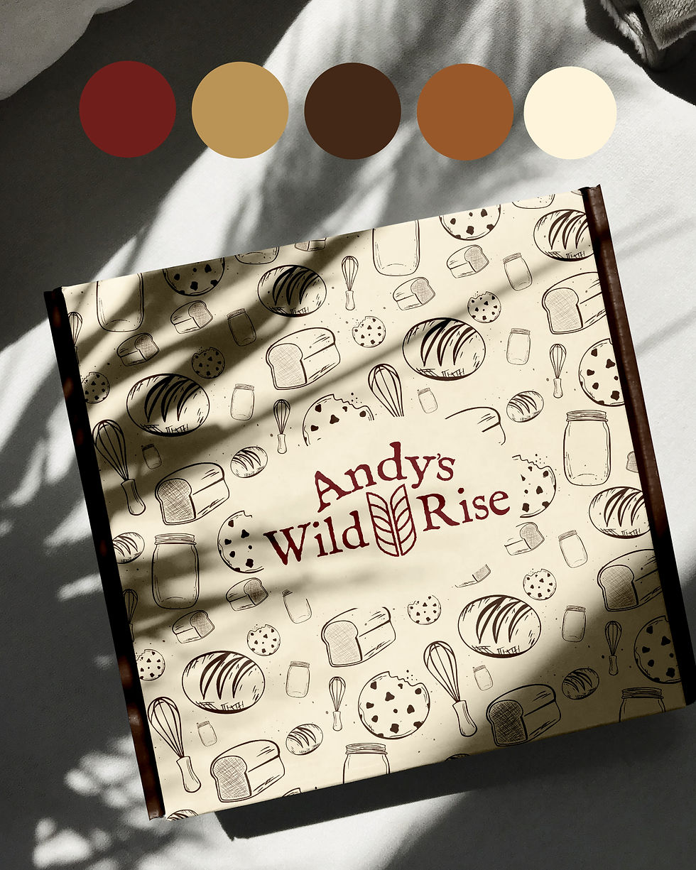
Sourdough Bakery Branding: Cozy and Handcrafted Brand Identity for Andy’s Wild Rise
- Brittany Hanlon
- Aug 27, 2025
- 3 min read


When Andria approached me to build a brand identity for her micro-bakery, Andy’s Wild Rise, I immediately felt the joy and intention behind her vision. She’s a military spouse and stay-at-home mom making sourdough products from home, rooted in tradition and handcrafted warmth. She wanted a brand that felt rustic, cozy, minimal, and authentic to her love of sourdough.
Branding Goals & Inspiration
From the start, we set clear goals for her bakery brand identity:
Convey an artisanal, handmade feel that speaks to authentic sourdough craftsmanship.
Reflect Andria’s warm and grounded brand personality in every visual touchpoint.
Incorporate a unique wheat-stalk element - modern, simple, and not cliché.
Include a pattern with hand-drawn baking elements.
Inspiration came from her story, the cozy rituals of baking, and the familiar textures of a home kitchen. We wanted a sourdough branding style that felt timeless, functional, and personal.

The Logo Suite
Every piece of the Andy’s Wild Rise logo suite was created with meaning in mind:
The abstract wheat stalk is a fresh take on a classic baking symbol - outlined, minimal, and organic. Rather than leaning on the overdone look of traditional wheat, this approach feels modern while still connecting back to breadmaking roots.
Nestling the wheat stalk inside the “A” of Andy’s makes the logo mark more personal.
The primary serif font (IM FELL English) adds rustic character and a timeless, artisanal feel.
The rough edging throughout gives the logo just enough imperfection to feel handcrafted, echoing the nature of sourdough itself.
This attention to detail makes the logos not only visually strong but also layered with meaning which give Andria an identity she can truly own and grow with.

Custom Hand-Drawn Elements
Every illustration, from the sourdough loaf and whisk to the baguette, cookie, sandwich loaf, and jar, was hand-drawn in Procreate to add personality and authenticity to the brand.
The seamless pattern features some of these hand-illustrated elements, complete with a custom flour-dust splatter brush for texture.
Color Palette
This warm, earthy palette combines deep berry, rich espresso, golden toffee, and creamy neutrals. Designed for a rustic bakery brand, it feels natural, inviting, and timeless—perfect for sourdough packaging and artisan branding.
Wildberry (#6F1D1B) — rich, red-brown depth
Honey Butter (#BB9457) — cozy golden tan
Espresso (#432818) — grounding dark brown
Maple Toffee (#99582A) — nostalgic caramel
Buttermilk (#FFEDC2) — soft creamy neutral
The Final Vibe for this Sourdough Bakery Branding
Andy's Wild Rise now has a brand identity that:
Is rooted in authenticity: Every texture, stroke, and font choice honors the handmade sourdough process.
Has a fresh twist on tradition: The abstract wheat stalk feels original and fitting for the brand.
Has seamless versatility: With icons and patterns in multiple formats and colors, the brand is ready to roll from product bags to social media.
With a logo suite, custom icons, and a cohesive color palette, Andy’s Wild Rise is ready to rise and shine in the world of artisan sourdough

Are you ready to elevate your baking business with custom branding?
I’m Britt — a freelance designer helping small businesses build beautiful, thoughtful brands that reflect who they are. If you're dreaming of a fresh look for your business — whether you’re just opening your doors or rebranding after years in business, I’d love to chat. From custom logos to full-service brand identity design, I help small businesses build brands that reflect what makes them different (and totally unforgettable). Reach out to start your own branding project.


Comments